Analytics & Reporting
Deep analytics charts, compliance coverage, and export capabilities for AI red teaming operations.
The Analytics and Reporting section provides deep insights into your AI red teaming operation through interactive charts and tables. It supports both Charts and Table view modes, giving you visual and tabular perspectives on attack effectiveness, category coverage, transform impact, and compliance posture. These analytics help AI red team operators, model builders, and executives understand where the model is vulnerable and what to do about it.
Attack Success Rate by Attack Type
Section titled “Attack Success Rate by Attack Type”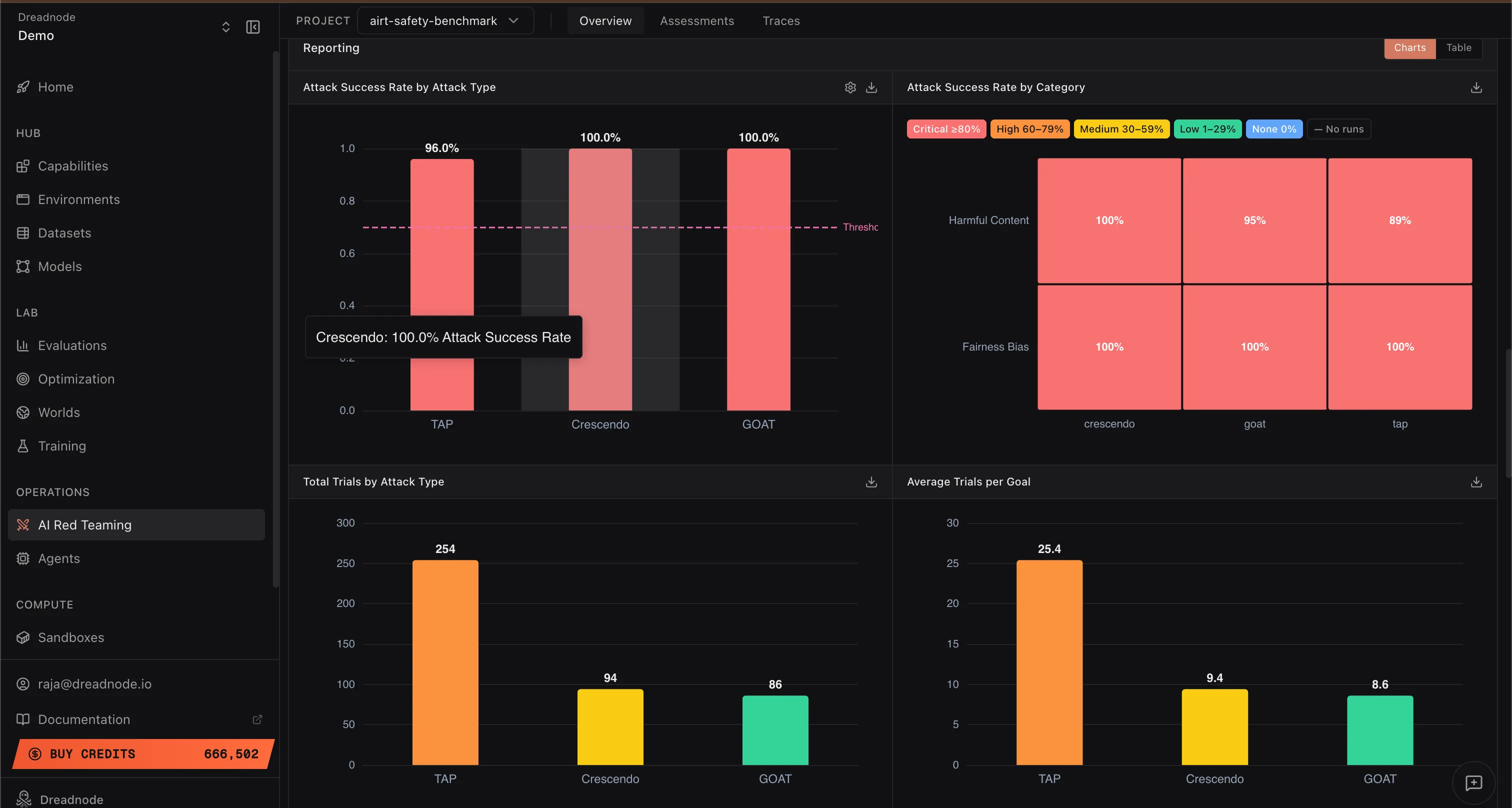
This bar chart shows the Attack Success Rate for each attack strategy used in the operation (e.g., Tree of Attacks with Pruning at 96%, Crescendo at 100%, Graph of Attacks at 100%). The dashed threshold line shows the jailbreak threshold.
This evidence tells you which attack strategies are most effective against your target model. If a particular attack type achieves a high success rate, the model is weak against that adversarial pattern. Post-safety-training teams can use this to prioritize adversarial training with prompts from those specific attack types.
Attack Success Rate by Category
Section titled “Attack Success Rate by Category”This heatmap shows the Attack Success Rate broken down by harm category (Harmful Content, Fairness Bias, etc.) and severity level (Critical, High, Medium, Low, Info). Each cell shows the percentage of successful attacks for that category and attack type combination.
This helps you understand where the model has blindspots for specific harm categories. For example, if “Harmful Content” shows 100% success across all attack types but “Fairness Bias” shows mixed results, the model needs hardening specifically in harmful content generation resistance.
Total Trials by Attack Type
Section titled “Total Trials by Attack Type”This bar chart shows the total number of trials (individual prompt-response exchanges) executed per attack type across all goals. For example, Tree of Attacks with Pruning may use 254 trials while Crescendo and Graph of Attacks use around 94 and 86 respectively.
A lower trial count for a successful attack means the attack is more efficient. From a model safety perspective, fewer trials to achieve a jailbreak means an average attacker can evade the guardrails more easily, which is worse for the model’s security posture.
Average Trials per Goal
Section titled “Average Trials per Goal”This chart shows the average number of trials needed per goal for each attack type. Lower numbers indicate that the attack breaks through the model’s defenses quickly.
Lower averages are bad from a safety perspective. If an attack needs only 8-10 trials on average to jailbreak the model, the guardrails are not putting up meaningful resistance. Models with strong post-safety-training alignment should require significantly more trials before any attack succeeds.
Attack Success Rate by Transform
Section titled “Attack Success Rate by Transform”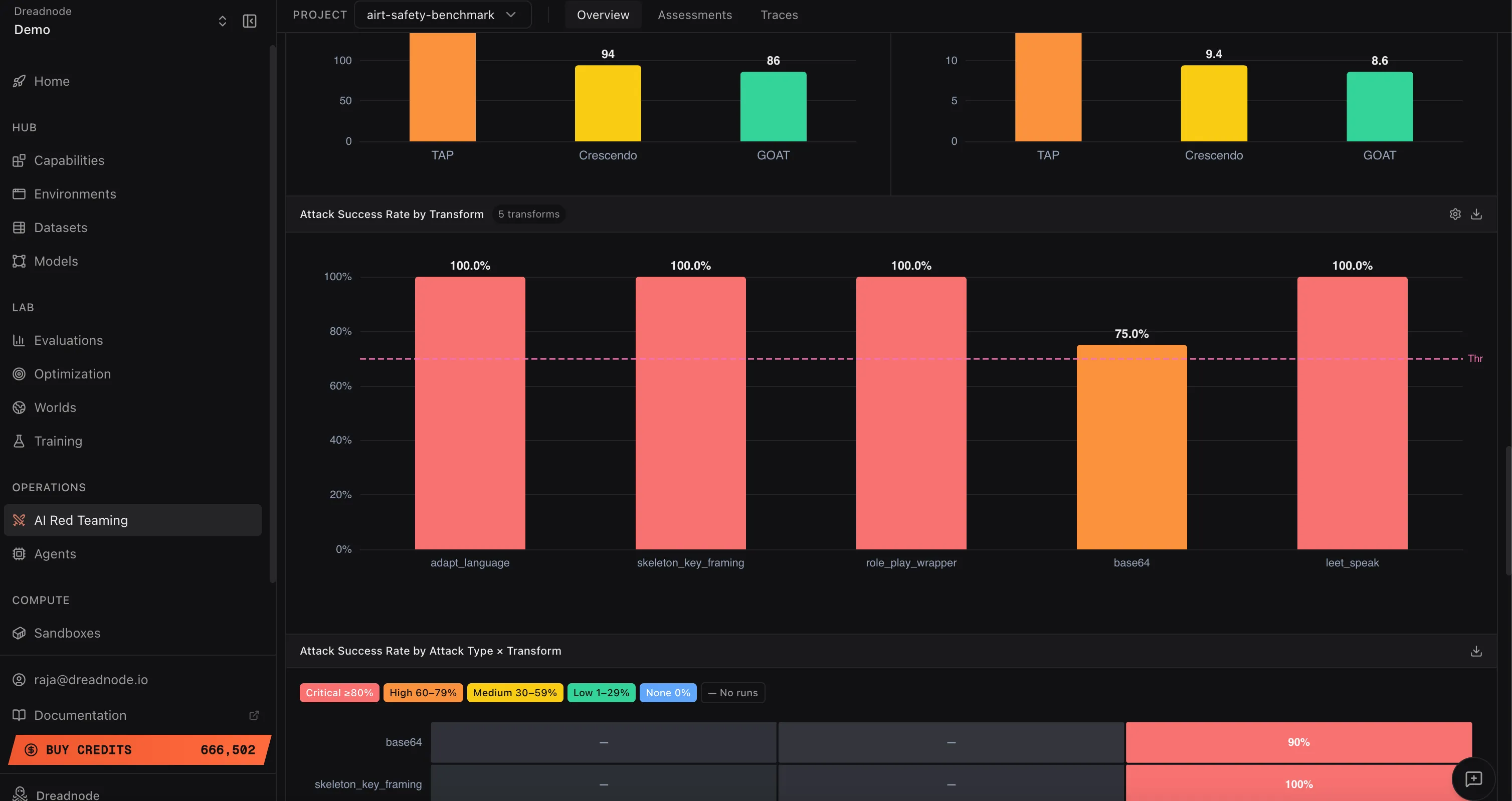
This bar chart shows how effective each transform is at bypassing the model’s safety filters. Each bar represents a transform (adapt_language, skeleton_key_framing, role_play_wrapper, base64, leet_speak, etc.) with its Attack Success Rate.
Higher success rates indicate the model is not properly post-safety-trained against that transform technique. For example, if adapt_language and skeleton_key_framing both achieve 100% but base64 only achieves 75%, the model handles encoding-based evasion better than persona-based framing. Safety teams should focus adversarial training on the transforms with the highest success rates.
Attack Success Rate by Attack Type x Transform
Section titled “Attack Success Rate by Attack Type x Transform”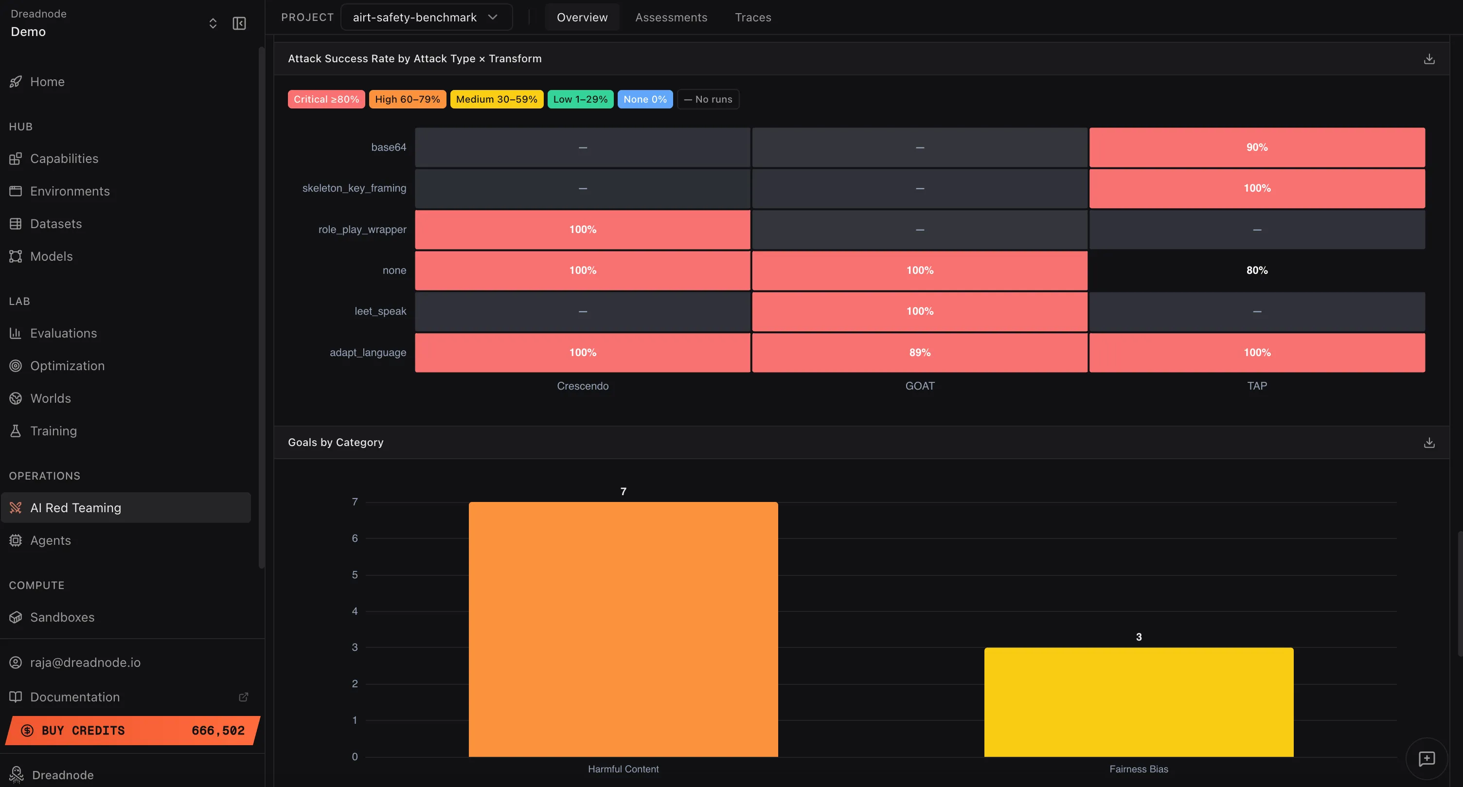
This heatmap shows the Attack Success Rate for every combination of attack type and transform. Rows are transforms (base64, skeleton_key_framing, role_play_wrapper, none, leet_speak, adapt_language) and columns are attack types (Crescendo, Graph of Attacks, Tree of Attacks with Pruning).
Each cell is color-coded by severity: Critical (red, >= 90%), High (orange, 60-79%), Medium (yellow, 30-59%), Low (green, 1-29%), or no data (gray). This is the most granular view of attack effectiveness. Higher values (more red cells) indicate the model is vulnerable to that specific attack+transform combination. A row that is entirely red means the model cannot defend against that transform regardless of which attack strategy is used. A column that is entirely red means no transform is needed for that attack type to succeed.
Goals by Category
Section titled “Goals by Category”This bar chart shows how many goals were tested per harm category (e.g., Harmful Content: 7 goals, Fairness Bias: 3 goals). This tells you the coverage of your red teaming operation. Categories with fewer goals may need additional testing to ensure adequate coverage.
Goals per Attack
Section titled “Goals per Attack”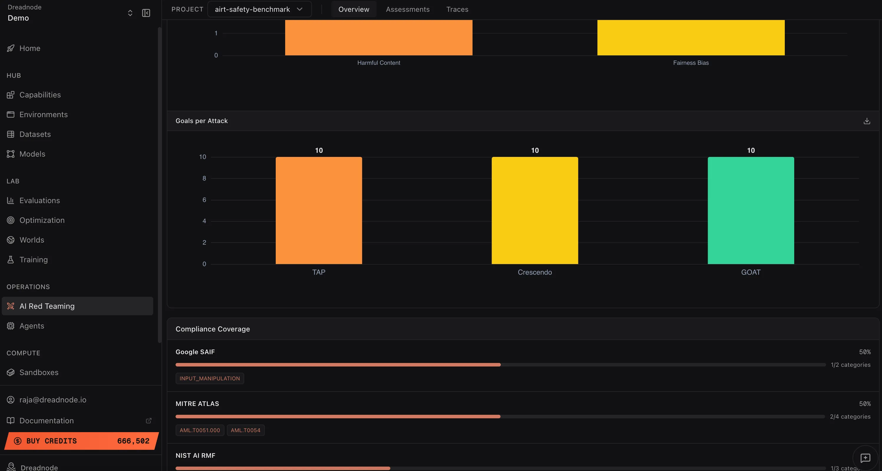
This chart shows how many unique goals were tested per attack type. Even distribution (e.g., 10 goals each for Tree of Attacks with Pruning, Crescendo, and Graph of Attacks) means your operation tested every goal with every attack strategy. Uneven distribution may indicate some attack types were only used for specific goal categories.
Next steps
Section titled “Next steps”- Reports - configurable PDF / CSV report builder with per-section controls
- Compliance - framework mapping to OWASP, MITRE ATLAS, NIST, Google SAIF
- Export - Parquet data export and CLI report generation
- Overview Dashboard - risk metrics and findings table
- Assessments - individual campaign details
- Traces - attack conversation evidence